Judge a Spine
January 23, 2020 3:55 am Leave your thoughts
I once bought a book that said it was a collection of stories in the “Sci-fi Romance” genre. The cover was awesome, I was in love with the thumbnail right away. The design was mostly white, dull silver/steel font, hints of weird flowers that don’t exist, and some cyber-goth-looking lady with great hair, gazing downward, all secretive and pretty.
I thought I’d be okay with the “romance” part and dive into the sci-fi. “Romance” to me always meant those daytime television dramas where the woman and man are just…nice to each other and eventually, after a lot of complications and tension, they kiss at the end. OR some medieval book or movie where the princess can’t marry the commoner knight but they have some poetic back and forth until someone hurls themselves off a tower or something.
I learned that “romance” meant people getting dowwwn, and sex, and titties, and stiff rods going into “love-tunnels.”
There were nipples and erections by page 7 of this book, right when I was settling into the make-believe planet’s weird environment and interesting animals and forests. Despite the genre and title, this actually caught me by surprise. I’m too innocent?! I thought romance meant Frog Prince shit! I like my questionable stuff to involve guns and blood, I guess. Getting this book all wrong was completely my fault…I’m told the font, flowers and the fact it said romance should have been enough for me to realise.
To be fair, judging a book by its cover does help sometimes, if they’re done right and suit the interior! Usually indie authors have a lot of input regarding their book cover, and their graphic designers deliberately try to make thumbnail versions stand out as well as incorporate the elements the author wanted.
Certain colours and composition convey genre even without a title needing to or having a fae woman stock photo on the cover. I know, it’s straight-forward, but it only occurred to me about a year after I released KOS.
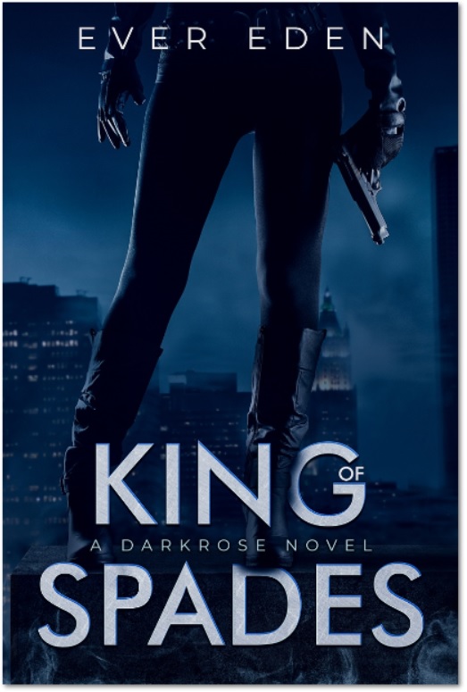
I wrote a post about the new cover for KOS. Even though the older cover is a fantastic piece of collaborative art, it didn’t speak to the genre I wanted to convey. This wasn’t anyone’s fault, I think myself and the (extremely talented, super-nice and accommodating) designer were just not as experienced at the time. I was used to controlling all aspects of my art/artistic vision and chose the colours and the model etc. without thinking like a Boss Lady regarding marketing and genre.
I’m pretty certain the cover didn’t tell anyone what the book was about and that probably hampered sales or buzz. There were most likely a few people who started reading it and probably felt ripped off it wasn’t an Urban Fantasy story. (I’m sorry!) So…I think my first KOS cover, although very beautiful, was judged differently than I’d hoped.
Gather round, children and let me tell you another tale…
I found a book (approx a decade ago) featuring a man and woman on the cover. They were both dressed in black, secret agent-looking, could have even passed for Trent and Cleo, which is what made the cover stand out to me in the first place.
The primary colours were dusty orange/brown tones behind them and they were standing on some kind of platform (if I remember correctly.) The woman had long dark hair and she was holding a gun.
The blurb was okay, it described some of the action and kickass stuff, and then there was one line which read, “he had the power to ramp her heartbeat up to 11” (or up to dangerous levels or…something like that) and (again!) I thought it just meant there was some sort of crush or background sexual tension between the main character and the guy she meets on her journey.
W
R
O
N
G
Granted, it took most of the book for it to become blatantly obvious the two were DTF but I overlooked and wrote off so many clues just waiting for action and fight scenes.
Then…one day I was sitting in a mid-city park and coffee area, twirling it in my hands and waiting for my next class when I saw the words “action romance” on the bottom of the spine.

I immediately texted a friend who’s all about those mommy-porn novels and asked WTF these words meant when used in conjunction with each other…and everything became so clear…
That was why they were in some underground swimming hole and the dude took his shorts off.
When books are lined up on a shelf, I can generally tell by the spine if it’s the book for me. What I look for is a combination of the colour of the cover (I like black, plain white, splashes of electric green, reds, steel grey.) I won’t bother if the font is too fancy – eg: gold script with lots of curls and swirls are usually indication it’s some vampire or romance novel that’s been done a million times.
(I’m not bagging your vamps. Really. It’s just not my thang.)
I’ve been wrong about covers. I’ve been wrong on the general vibe of the book enough not to notice it was “romance,” until a penis sprung out, but paying attention to the spine hasn’t screwed me…unless I just jinxed it by writing this.
I’m saying that if I had a confusing cover in front of me and a book that was facing away with just the spine showing, I’d probably make a good guess about the subject matter in the second one.
Spines haven’t lied to me…yet.
TLDR: *You can judge a book by the cover a lot of the time. Sometimes you will be wrong due to your wishful thinking or the author/cover designer’s mismatch.
*”Romance” really means bobs n vagene.
*I should pay more attention to what I’m reading.